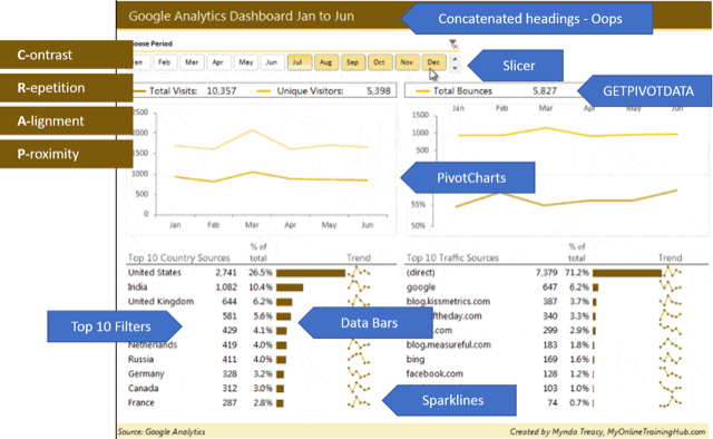
Microsoft Excel Advanced: Dashboard Building
Explore the graphical elements used to present your dashboard, particularly lesser known chart types such as the Bullet Chart, doughnut charts and Excel's Sparklines. For the advanced Excel user who can already use PivotTables. This course is not scheduled yet for 2025. Please express interest in the link below and we'll schedule a course when there is sufficient interest.
Interested in attending any future dates of this course?
Register your interest now
Description
"A dashboard is a visual display of the most important information needed to achieve one or more objectives; consolidated and arranged on a single screen so the information can be monitored at a glance."
Excel Dashboard designers often utilise multiple PivotTables to generate summaries on sheets which can later be hidden along with other data gathering calculations. These summaries provide the essential data for graphical displays like charts and conditional formatting on the actual dashboard itself.
This course focuses on the tips and tools you can use to create your Dashboard interface rather than on building the PivotTables themselves (PivotTables is a separate course). Knowing how to use GETPIVOTDATA to extract key information from supporting PivotTables is vital. We will look at the role of Slicers and also controls such as drop down lists and radio buttons to allow users to control the display.
As well as looking at graphical items such as Bullet Chart, doughnut charts and Sparklines, we'll look at ways of adding more information to the chart such as customised data labels (which involve some very intense calculations).
Key content:
- Use GETPIVOTDATA with IFERROR to retrieve values from a Pivot Table
- Develop displays based on the content of a number of supporting Pivot Tables
- Use linked slicers to change the content of these Pivot Tables and charts
- Create concatenated titles on the dashboard for the current selection
- Explore Sparklines and utilise conditional formats such as data bars and icons
- Create Chart Staging areas on sheets that can be hidden
- Understand the Data Model for analysing data stored in multiple tables versus the use of VLOOKUP functions to 'combine' data
- Recap hiding sheets containing data or calculations and protecting your Dashboard
Objectives
- Use custom calculations and the GETPIVOTDATA function with Pivot Tables
- Become aware of the possibility of using a 'relational' data model
- Explore chart building skills and conditional formats
- Looks at ways to control what is displayed such as Slicers and form controls.
Who should attend?
You should be an experienced Excel user already familiar with creating and customising PivotTables

Prerequisites
You should already know how to create and customise pivot tables.

